
Every interactive element your landing page can use, in one place.
A living showcase of clarity, engagement, movement, and self-identification patterns — each one rendered live, so you can feel exactly how it converts before you ship it in Lovable.
Part 01
Elements that improve clarity
Help people instantly understand what this is, who it’s for, and what happens next.
Clarity · 01
FAQ dropdowns
Why it works · People get clarity without slogging through giant paragraphs.
Clarity · 02
Expandable sections
Why it works · Keeps the page visually clean while still letting curious people go deeper.
A short summary the reader sees first.
One or two lines so scanners get the gist.
Clarity · 03
Before / after comparisons
Why it works · People understand transformations visually much faster than through explanation.
“Join my course to learn how to grow online and unlock real results today.”
Vague. Generic. Could be anyone.
“The 3-page funnel that turns quiet creators into $2K months — without daily posting.”
Specific. Concrete. Aimed at one person.
Clarity · 04
Visual flow sections
Why it works · Reduces cognitive load and helps people understand the journey at a glance.
Step 1
Content
Step 2
Entry Page
Step 3
Funnel
Step 4
Offer
Especially effective when teaching how a funnel actually moves a reader forward.
Clarity · 05
Images & visual mockups
Why it works · Makes the resource feel real and tangible. People process visuals faster than text.
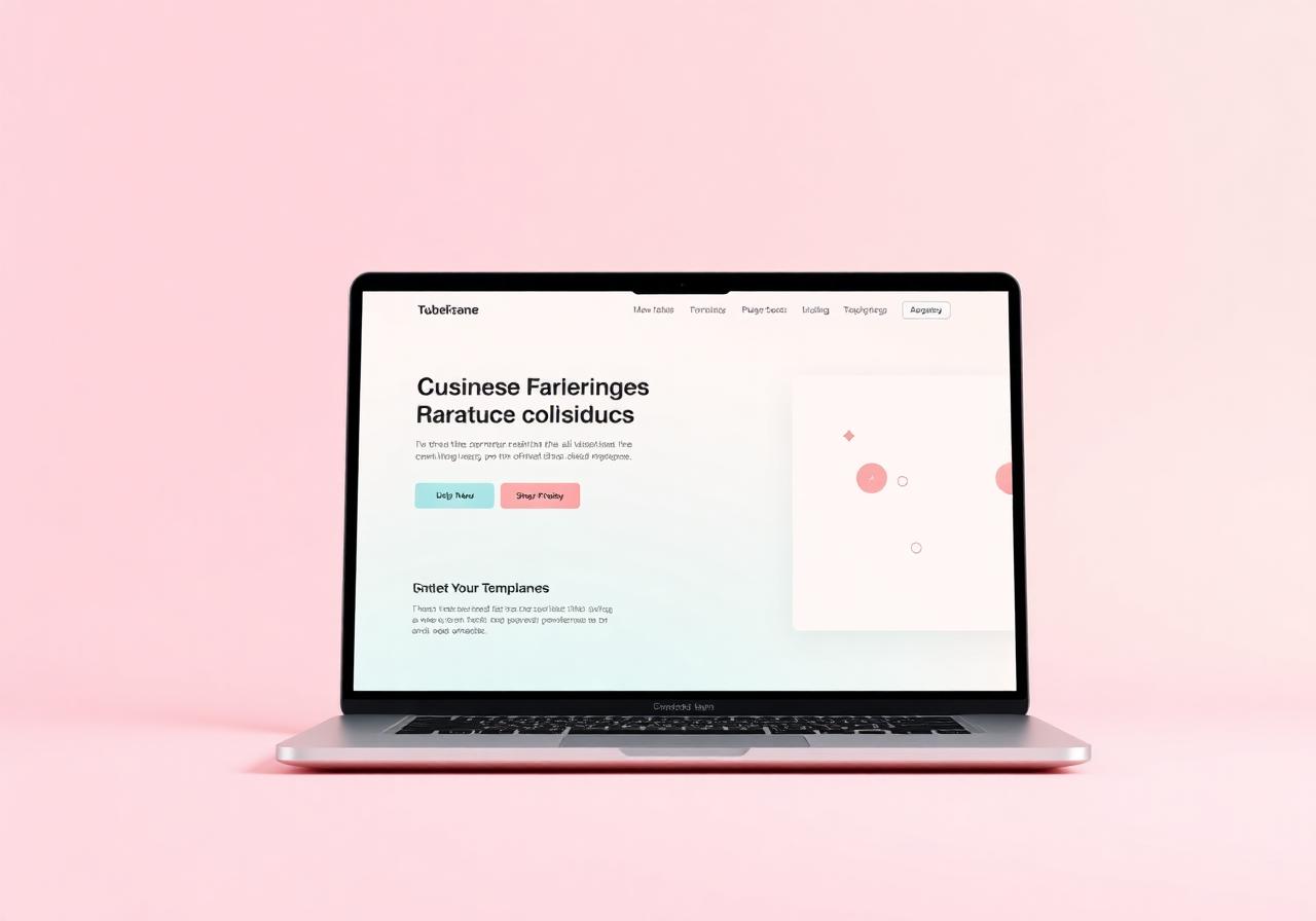
Freebie mockups, screenshots, dashboard previews, workbook previews — anything that supports clarity instead of distracting from it.
Part 02
Elements that increase engagement
Invite people to interact instead of passively scrolling.
Engagement · 02
Hover effects
Why it works · Makes the page feel alive without overwhelming the user. Best when subtle.
Subtle lift
Cards rise on hover.
Button shine
Soft gradient sweep.
Icon glow
Color warms on hover.
Engagement · 03
Before / after slider
Why it works · Creates interaction while simplifying visual understanding of a transformation.
Before — cluttered
After — calm & clear
Engagement · 04
Click-to-reveal sections
Why it works · Encourages curiosity while keeping the page visually clean.
The messaging mistake
“Sign up for my newsletter to learn marketing tips and tricks.”
Engagement · 05
Video embeds
Why it works · Builds trust and connection quickly — especially when the creator explains what this is, who it’s for, and what result it creates.
Part 03
Elements that improve movement
Move people deeper into the funnel with less friction.
Movement · 01
Multi-step opt-ins
Why it works · Each micro-commitment makes people more likely to finish what they started.
Step 1 of 3
Ready to see what your page is missing?
Movement · 02
Progress indicators
Why it works · People feel motivated to complete what they’ve already started.
Movement · 03
Sticky CTA buttons
Why it works · Keeps the next step visible without making people scroll back up — especially on mobile.
Scroll this little preview window…
Long copy keeps explaining the offer in detail.
More benefits. More objections handled. More social proof.
And then a long story about why this matters.
People keep reading…
…and reading…
…and the sticky CTA stays put.
See the full-page version pinned to the bottom of this site on mobile.
Part 04
Elements that increase self-identification
People trust the solution more when they identify the problem themselves.
Identify · 01
Quiz-style questions
Why it works · Creates immediate self-awareness and emotional relevance.
What’s currently stopping your content from converting?
Identify · 02
Mini assessment / scorecard
Why it works · People trust solutions more when they identify the problem themselves.
Rate your funnel clarity
Your score · 0/5
0% clarityBig opportunity — start with one clear promise.
Identify · 03
Personalized results sections
Why it works · Feels personalized and premium while guiding people naturally into the next step.
You likely have a messaging problem.
Your offer might be solid — but the words in front of it aren’t pulling the right person in. Start with the headline.